Sketch Text
Click a point in a sketch, type some words, and they become closed outlines in the sketch. Extrude and Cut use those outlines like any other drawn shape, and the holes in letters such as O, A and B stay holes.
What you get: the words you type, as closed letter outlines in the sketch, that Extrude raises or Cut engraves, and that you can open and edit again later.
When to Use It
- Raise or engrave a name, a part number or a label
- Cut letters through a plate
- Make a stencil: cut the letters, or use Flip side to cut to keep only them
Step by Step
- Open a sketch on a plane or a face (see Planes and Faces). Sketching is part of modeling, which comes with the Pro plans.
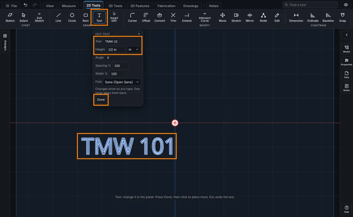
- On the Sketch tab, click Advanced, then Text. The Text panel opens.
- Type the words in Text, the size of a capital letter in Height (type any unit after the number, like
12mmor1/2 in), and pick a Font. At Angle 0 the text reads left to right as you see the sketch on the screen (on the Top, Front and Right planes too), with the letters standing upright; Angle turns it counterclockwise from there. Spacing % sets the gap between letters (100 is normal, 150 spreads them out, 80 packs them closer) and Width % sets how wide each letter is (100 is normal, 120 widens every letter, 80 narrows it). Both go from 10 to 1000. - Click in the sketch where the text should start. The left end of the words, on the line they stand on, sits at your click. A message says "Text placed. Change the words, height, font or angle in the panel; Extrude or Cut uses its outlines."
- The text appears as outlines. Keep changing the words, height, font or angle in the panel: the outlines are rebuilt as you type.
- Press Done to finish this text and click again to place more, or press Esc to end the tool.
- Choose Extrude or Cut on the Features tab. Every letter is a profile.
Change the Text Later
- Double-click the text, or right-click it and choose Edit Text. The panel opens with its words, height, font and angle.
- Change anything, spacing and width included. The outlines are rebuilt from the same text, so the letters stay true at any size.
- One Undo takes back a whole change.
- Drag the text with the Select tool to move it, or choose it and use Move, Rotate and Scale to move it by a distance, turn it by an angle or make it larger or smaller.
Fonts
The Font list has a plain sans serif and a monospaced one, then three groups for laser work, and your own fonts if you added any (see Your Own Fonts below). The fonts that ship are free to use. A font is loaded the first time you use it, so the first click may take a moment.
Fonts for a Laser
- Laser etch: single-line. Plain, Readable, Square (a CNC look) and Serif. Every letter is one pen stroke, drawn as a thin outline about 4 percent of the letter height wide. Best for marking a part number or a name with a light etch.
- Laser etch: outline. Tech mono and condensed capitals: clean outline letters that etch well and stay readable when small.
- Laser cut-through: stencil. Four stencil fonts in which no letter has a loose centre, so the middle of an O, A, B, 8 or 0 does not fall out when the letters are cut through the plate.
Etching is not cutting. To etch, use Cut with a depth, such as 0.4 mm. The engraved letters do not count as holes: Cut Files and Nest write them to a separate ETCH layer in the DXF, with the depth in the label, for the laser's mark pass. See Export Cut Files.
Cutting Letters Through
For a normal font, the loose centres of letters such as O, A, B, 8, 0, P, Q and R are shown in the Laser check under the panel. Pick a stencil font, or tick Bridge islands: each loose centre is joined to the plate by a thin bridge of material that is left uncut. Leave the bridge width empty for automatic (8 percent of the text height, and at least twice the laser beam). Type the Laser beam (the width of your laser cut, 0.15 mm if you do not know) and the check warns when letters are thinner than the beam can hold or a bridge is narrower than two beam widths.
Single-line fonts are traced as thin outlines, not along the middle of each stroke. That suits a mark pass. A true centre-line toolpath is not made yet.
Your Own Fonts
To use a font that is not in the list, such as the font your laser shop already uses, add its file to your account. You need to be signed in with a confirmed email.
- In the Text panel, tick I may use this font (whether a font may be used for your job is for you to say).
- Click Choose file... and pick a TrueType, OpenType or WOFF file (up to 8 MB).
- The font appears under My fonts (private to this account) in the Font list and is picked for you. Name, size and the rest work as for any font.
Only the shapes of the letters are kept (Latin letters, digits and signs, U+0020 to U+007E and U+00A0 to U+00FF), not the font file, and only your account can see or use them. A share link, an embed or another account cannot. You can keep up to 5 fonts of up to 400 KB of outlines each. Pick a font of yours and press Remove font to take it away; text that still uses it shows in Sans. Kerning and ligatures are not used, so the letters sit the same in the viewer and in the AI.
If a model with text in one of your fonts is opened in another account, or after you removed the font, the text is shown in the plain sans font with a message, and the text stays editable. The AI lists your fonts with text_fonts, uses one as the font of a text shape (my- and eight letters or digits) and can remove one with text_font_remove. Adding a font needs the file on your computer, so it is done here in the panel.
Text Round a Circle
To etch the rim of a round part, tick On a circle in the Text panel and type the Radius of the circle the letters stand on. Then click the centre of the circle (not the start of the words). The text keeps its size and runs along the circle, reading left to right. Angle is where the middle of the text sits, counterclockwise from the right: 90 is the top (the default), 270 the bottom, 0 the right. Tick Round the inside to put the letters inside the circle, standing toward the centre and reading along the bottom.
The text must be shorter than the circle (up to 340 degrees) and, round the inside, shorter than the radius. Otherwise it is refused in words and the last good text stays. Edit the text later with a double-click: the radius and angle come back. Move, Rotate and Scale carry the circle with the text. Bridge islands and the laser fonts work the same round a circle. The AI build_part text shape takes the same thing as arc with radius, angle_deg and inside, and place is then the centre of the circle.
While you place the text, a dashed circle of the radius you typed follows the pointer, so you see where the text will go before you click. When you edit the text, the dashed circle stays on its circle. It is only a guide: it is not part of the sketch.
Text Along a Path
To put text along a line, an arc, a circle or a curve, tick Along a path in the Text panel, then click the line or curve in the sketch. Straight lines, arcs, circles, splines, ellipses, polygons and combined outlines all work. To follow an edge of a model, use Convert on the edge first; the piece it makes is then a line, arc, circle or curve you can click. The pointer shows the piece it would pick as a dashed line. The text keeps its size, reads from the first point of the line to the last, and stands on the left of the way the line runs: above a line drawn to the right. Tick Run the other way to start from the other end and stand on the other side. A circle runs counterclockwise, so its letters stand inside it unless you tick Run the other way.
The box next to Along a path is the position of the middle of the text along the line, as a percentage of its length: 0 is the start, 50 the middle, 100 the end. On an open line the whole text stays on the line, and an empty box means 50. On a closed one, such as a circle, the text wraps round and can begin anywhere; an empty box puts the middle of the text where it reads the right way up: at the bottom when the letters stand inside the outline, at the top when you tick Run the other way and they stand outside.
The text must be shorter than the line. A sharp corner under the text (more than 50 degrees) is refused, because a letter cannot go round it, and so is a bend tighter than the letters are tall. Round the corner or move the text to a smoother part. The refusal is in words and the last good text stays. The path is copied into the text when you click it: changing the line later does not move the text. To follow a new line, edit the text and click the new line. Move, Rotate and Scale carry the path with the text. Bridge islands and the laser fonts work the same along a path, and Along a path and On a circle are one or the other.
The AI build_part text shape takes path with points (at least two, a curve needs many), spline (a few points a smooth curve goes through, the same curve the Spline tool draws) or of (the id of an earlier line, arc, circle, rectangle or polyline in the same sketch), and closed, position_pct and reverse. place and angle_deg do not go with it.
Things to Know
- Height is the height of a capital letter, not the full height of the line.
- Curves are cut into very short straight pieces, within a fraction of a percent of the true shape. Very small text is fine, but each letter is a polygon.
- Letters that touch or overlap each other are not merged. Keep a little space between them.
- Each letter becomes its own step in the Model tree when the text is extruded or cut, and a letter with a hole (O, A, B) is one step with the hole left open.
- Spacing and Width are percentages of the letter, so they stay right when the text is scaled. Text you drew before these boxes existed has both at 100 and looks exactly as it did.
- Text placed before 6.343.0 keeps the direction it was saved with, also when you edit it, and its Angle box shows the angle it was saved with. New text reads left to right on the Top, Front and Right planes at Angle 0. To make an old label follow the screen, delete it and place it again, or turn it with Angle.
- Characters the font does not have are refused by name. Text can be up to 200 characters. Text is left out of the sketch Mirror on purpose: mirrored letters would read backwards, and a flipped sketch text is not a text you can edit. Mirror the extruded letters with Mirror Features instead.
- Empty text is refused, and so is a height of zero.
- A saved sketch keeps the text itself, not only the curves, so you can reopen and edit it.
Common Mistakes and Messages
- "Type some text first." The Text box is empty. Type the words, and the outlines come back as you type.
- "Type a text height more than zero, in any unit." The Height box is empty or 0 when you click to place the text. Type a height such as
1/2 inor12mm, then click. - "These characters are not in the font: ..." The message names the characters the font cannot draw, such as a symbol or a letter from another alphabet. Take them out of the words.
- "Text can be at most 200 characters." Split long words into two pieces of text.
- "Sign in to add your own font." Adding a font needs a signed-in account.
- "Tick I may use this font first." Tick the box above Choose file... before you pick the file.
- A font that is too detailed. A font with more than 400 KB of outlines is refused with a message that says so. Pick a simpler font.
- "An account keeps up to 5 fonts. Remove one first." Pick one of your fonts and press Remove font.
- Letters that touch come out wrong. Letters that touch or overlap each other are not merged into one outline. Set Spacing % above 100, such as 120, so the letters stand apart.
- The text reads backwards after Mirror. Sketch Mirror leaves text out on purpose. Mirror the extruded letters with Mirror Features instead.
Related Tools
Align and Offset
Below the circle and path boxes, Align says which part of the text sits at the angle or position you gave. Centre puts the middle there, Start puts the first letter there, End puts the last letter there, Fit stretches the text to fill the whole circle or path (the letters keep their height), and Fit by spacing keeps every letter's shape and width and opens or closes the gaps between them instead (it needs two or more letters). Round a whole circle or a closed outline both leave a gap at the join: Gap at the join sets it (empty is automatic: half a letter height under Fit, and under Fit by spacing a gap that opens and closes with the others like a space between words; 0 puts the last letter against the first). When the text you are editing lies on another text of the sketch, a warning under the laser check says so; letters crossing letters would make a mess when cut or etched. On a face of a part, letters that run over a hole or the edge of the face get a warning too, and show red, because a letter there is cut away or merged with the hole in the cut file. Offset moves the line the letters stand on away from the circle or path, toward the side the letters stand on. Type a minus sign to sink them the other way, like -0.1 in. Letters that would crowd on a tight inside bend, or that Fit stretches a lot, get a warning in the panel. One Undo takes a change of Align or Offset back.